Meddle Dating App
Team
Derek Tseng, Mo Lalehchini, Pete Bush
Role
UX Researcher, Content strategist
Duration
3 weeks
tools
Sketch, Invision, audio recorder, screen recorder, Xtensio
goals
Make the onboarding process for “Meddlers” easier and more inviting, redesign to be be more informative.
What is Meddle?
Meddle offers an innovative approach to online dating. All you have to do is invite your most trusted friends and family members to be your Meddlers, and they'll take it from there. They would love to take credit for your next great date anyway! They don't use highly sophisticated matching algorithms to find you that perfect person. Your Meddlers are the algorithm. Also, rather than going to a professional matchmaker who you've never met before, your Meddlers know you better than anyone else (and they probably know who would be good for you, too). Meddle is completely free to use and is available for iOS and Android
current screens
The task
We met with Meddle’s co-founder, Peter Leonard to see what issues he wanted to address.
The process of signing up to be a “Meddler” on Meddle had a very cold and robotic feel. It made the steps feel long and cumbersome. Not a lot of people were becoming Meddlers and we wanted to find out exactly what we could do about it.
Task number 1 was to guide the potential Meddler through the process in a fun and engaging way. And to come up with a way an easier way to invite others to join (on the ios platform)
Task number 2, if time permitted was to work on the Meddle website.
One of the additional challenges presented in that meeting with Peter was that he didn’t want it to look overly like a dating site (no pictures of couple holding hands and such). Peter’s long term vision for Meddle was to reach beyond just dating and into other group decision making. So he didn’t want to be seen as just a dating app.
the approach
The first thing we had to ask and answer was “who are the meddlers?”. The vision of Meddle was to be able to incorporate people who may have missed the fun of dating apps. The people that have been in relationships or even married for a while that didn’t get the chance to “swipe”. So with this in mind I did a deeper dive into the age demographics and popularity of online dating.
What I found was a pretty even usage between the ages of 18 - 54. I decided to focus around the mid 30s to early 40s for Meddlers. My rationale was that this age is tech savvy enough that they would consider an app like Meddle to help set up their friends on dates rather than what has been the traditional route of just setting them up with someone they know. A demographic that typically turns to tech first with their issues. Plus some may have experience with these apps as well and be able to tell me some of their pain points.
testing
I reached out via Facebook to find people in the age demographic for 1 0n 1 interviews and reached out to my contacts to find people willing to download the app to tell me about the process. Meanwhile I composed a list of interview questions. The first bit would be about online dating in general and the second about Meddle specifically.
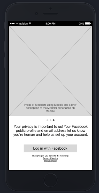
The findings immediately were backing up the problem statement; cold, confusing, “what is this logo?” “Am I supposed to be a meddler or a single?”. Additionally every single person brought up that they don’t like having to use Facebook to create an account. One person couldn’t participate because they didn’t have a Facebook account. Another issue was the fear of setting their friends up on a bad date and the possible fallout from that.
The Competition
When looking at the competition I wanted to see who the big players were, and the ones who were most like Meddle's concept. I created a chart showing this and the features, pricing, and login methods of these competitors.
What I found interesting about this is that if they didn't have an additional option besides Facebook of login in, they all had plans listed on their company site saying that they eventually would. In the course of this project Facebook announced that they would also be launching a dating app. When it was announced the stock of the dating site, Match dropped 20 points. I will be curios to see how the Facebook dating app continues to effect the current apps on the market.
initial interviews and findings
In my interviews I asked if the interviewee had used a dating app. If they had I would follow up with questions about that experience. Other questions revolved around what they liked, disliked, if any apps had made changes in the course of them using it that they felt made it better or worse, if they had set up any friends on dates, if they had been set up by friends, can they think of a friend they would set up on a date?
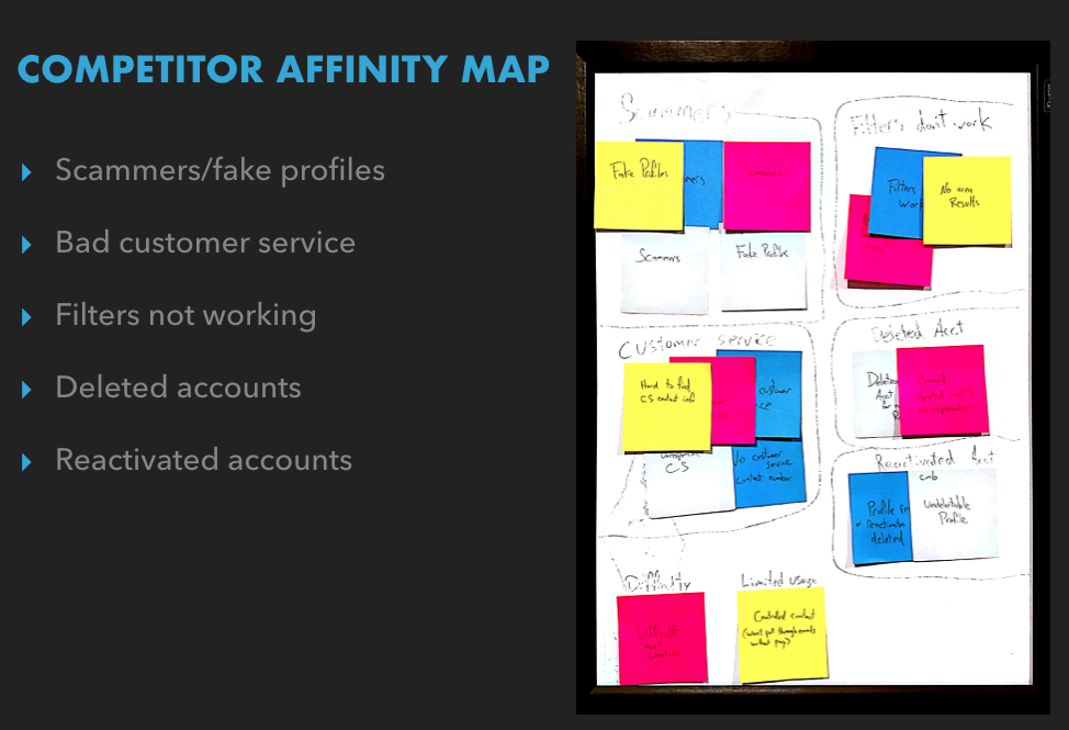
After that I started combing through the reviews of the competitors online to build an affinity map of the issues and I found that the biggest reported problem with online dating are the scammers and company made fake profiles, and catfishers. The scammers set up profiles, engage in conversation and eventually start asking for money. Some dating apps have been known to create fake profiles to build up their roster so new people will have more profiles to look through. A "catfish" is someone who pretends to be someone else online. This person completely assumes a fake identity and goes the extra mile to make their victim believe that they are exactly who they say they are
A close second complaint was customer service. Not being able to get ahold of anyone when things go wrong. Just an email address that will get you an auto-response and no follow-up.
I took all of this information and it became the basis of my persona.
persona
Meet Audrey!
Audrey is a great representative of the demographic we're after. Someone who is social and of the age where she's familiar with the current apps and trends, but not overly tech savvy. She learns of trends through referrals of friends and through the major places like Facebook and Google.
Design
So now we know who we're designing for and who to bring these tests to. Derek sketched out the basics on paper and I took those to some of the people I initially interviewed to see if they felt it improved the design. I filled them in on the language that would be used on each screen as they went through. From that I found that there was of course still hesitation about logging in with Facebook but otherwise the flow felt good and intuitive.
With these findings we felt we were ready to move on to the mid level interactive prototype. So we loaded photos of the paper prototype into InVision and I took it out into the world for people to test. I took these mid level clickable prototypes out in the field to test. There were hesitations about all the notifications that pop up. It felt intrusive and still cold and mechanical. This goes back to the issue of trust with these apps. The “why do they want my info? What are they going to do with it?” questions that come up when they see those notifications.
Clickable Prototype
With these insights we moved on to the next level of our clickable prototype. We added in a few screens and messages to be a sort of preemptive strike for the coming notifications. As a way to say to the user that this is why we need you to do the thing you’re about to be asked to do. Forging trust through transparency. From there we started crafting our messages, scenarios, tasks and higher fidelity screens.
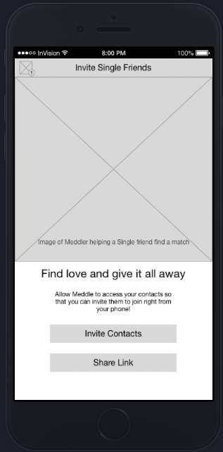
I took these clickable prototypes into the field for testing. I watched as the testers smiled when they came across certain messages like “Find love and give it all away”. And that was exactly the point, to make it a pleasant experience to go through. Things flowed a lot better. The new testers were able to figure out what was going on and what they needed to do to complete the tasks. I had them sign up as meddlers with and without a link to the app. And then invite friends by importing their contacts into the app in the way that Snapchat works. Everyone got through the tasks easily. Some of the testers felt a few screens were unnecessary, like the screens were repeating information or saying things that could be easily assumed. So we went back in and condensed some of the information and eliminated a couple of other screens as well. We brought this back out into the field and it became our final iteration. Testers made their way through the app signup process and enjoyed the content along the way.
With these positive testing results we were confident to go forward with the high fidelity screens. We put it all together and presented to Peter and he loved the work we did.
The Logo
The first thing we were told when sitting down with Peter was that he knows that the logo wasn’t popular but not to bother working on it because he had sentimental reasons for it. At the very end of our presentation our designer, Mo had worked on something that had an ever so slight but wonderful change to the existing logo. So slight that when presented Peter asked what was different about it. Then Mo pointed out with one line out and a slight bend to another it creates a heart. Peter loved it! And for the first time he accepted that change and it is now the company logo.
next steps
Peter was hopeful we would have enough time to work on his website as well. Unfortunately we did not have that time but we found some great, free resources for him to use when the time comes for him to update it and included that info in the slide deck. In addition to that, I stressed the importance of looking for alternative ways to sign up besides Facebook. I mentioned the analytics to keep an eye on after making these changes to see if they are indeed working. To look into ways of incorporating video. Not a forum about online dating goes by without mentioning that video is the way of the future. And finally to keep December 26th circled in red on the calendar. There’s a 60% spike in online dating profile creating between 12/26-1/14. Any changes and launches should be done with this in mind.
Takeaways
Besides learning about the many many dating apps that are out there, this project taught me a lot about working on a good UX team. The team had a methodical approach to the scheduled tasks and I felt we really played to our strengths and created some great improvements to Meddle. The process was never interrupted by ego as all ideas were discussed with the knowing that all decisions were made for the best of the project. I felt like this was an incredibly important lesson to learn. Being able to freely communicate issues and discuss ideas without taking things personally


